Xaviren is a Concept Artist and an Art Director based in London. He works for big clients like: NETFLIX, MARVEL, NIKE and EA SPORTS. His work is stunning, if you need his services drop him a line!
Scrolling down you can see the steps and process I followed to come out with the end results.

Brief:
Getting a good brief is the hardest part of these kind of projects.
He wanted me to make a new logotype for his professional persona. After a long talk and taking some notes I had an understanding of what he was looking for. Then we agreed on the deliverables.
Listening to your clients is very important, while talking, he said things like: “Brush mercenary” and “Digital painter“. This comments gave strong directions on what he wanted. Images are very helpful to have as references. Ask your clients to share some with you before starting!
Research:
Recognizing what context you are doing a logo for, it’s very important. Take into account visual languages, aesthetics and background for each project.
In this case, Xaviren’s background is: concept art, art direction, film industry, digital art, brushes and pixels. I researched the visual trends and languages for these fields and got an idea of what was closer to my client’s references.
First ideas:
This is my favorite step! Once you have a clear goal and some directions you can start! Take a pencil and lots of paper.
At this point all doors are open, so no pressure just try to have fun, experiment and make mistakes!
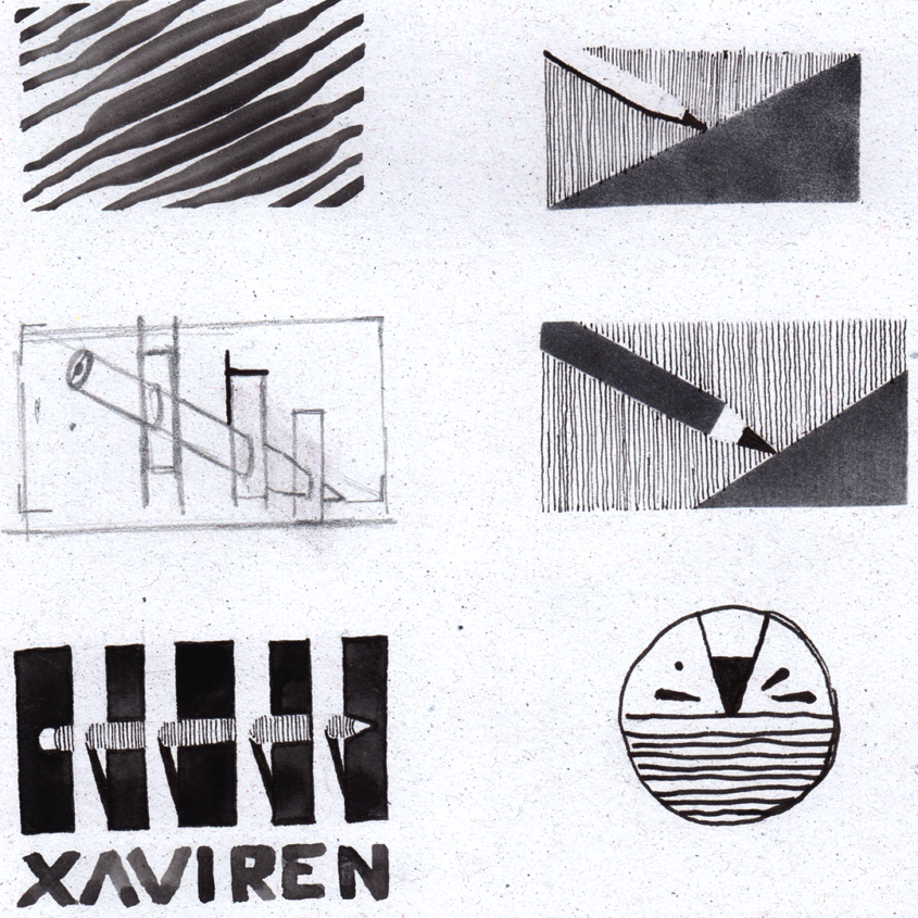
My mission is to find the essence of what the logo has to communicate. Build a narrative with fewer elements. Throw ideas at it, work with opposites, use a stamp, create a texture, etc…
First drawings are the freshest try to recycle them and work around them.
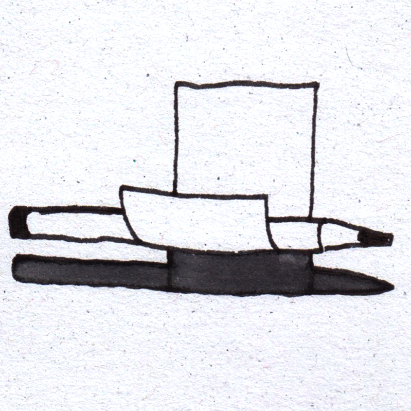
Here are some of the ideas:

Drafts:
From the start, Xaviren mentioned he uses post-its to start a project, to do the first sketches. That’s why I did so much ideas with paper elements.
After showing all the sketches to my client, we decided that we should move away from the “paper” concept. We also noticed that two concepts came again and again in our conversation: Brush and Pixel.
My mission was to embody these two ideas in a logo. Here are some of the drafts or selected ideas that I presented to Xaviren.
Take a look.
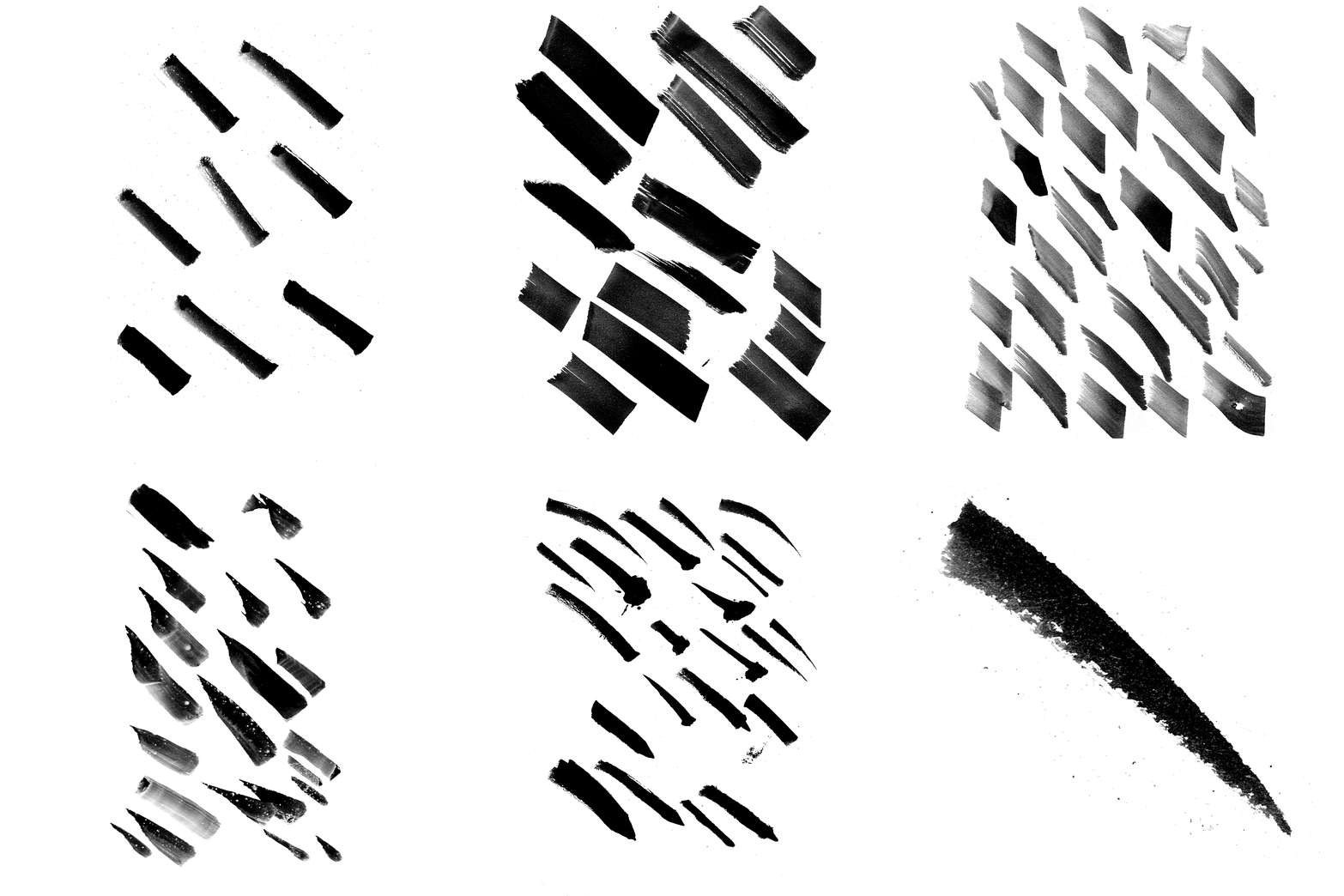
These are just a selection of them.
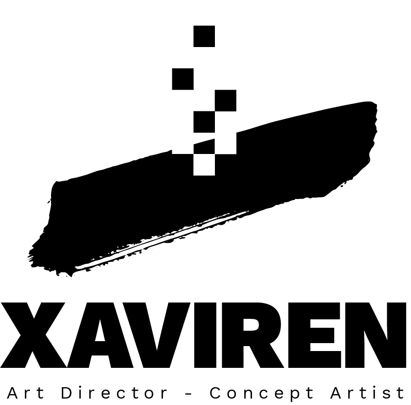
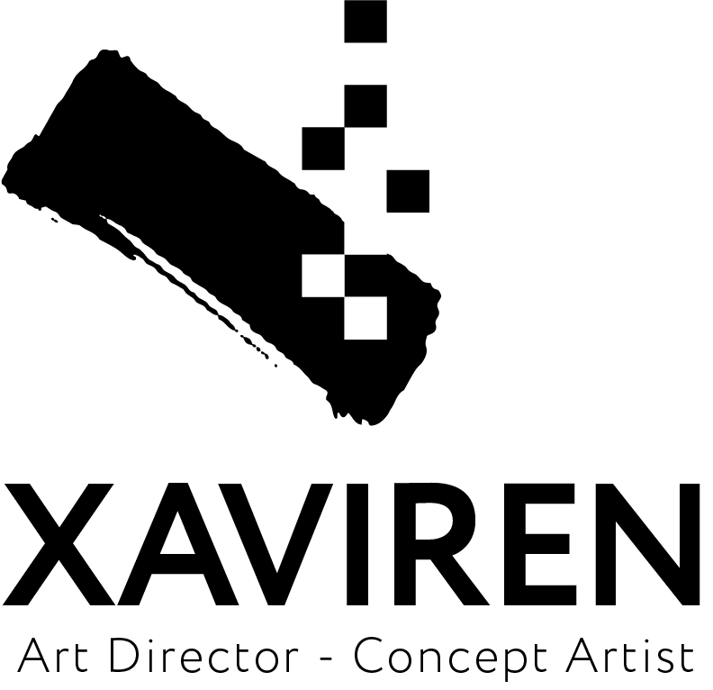
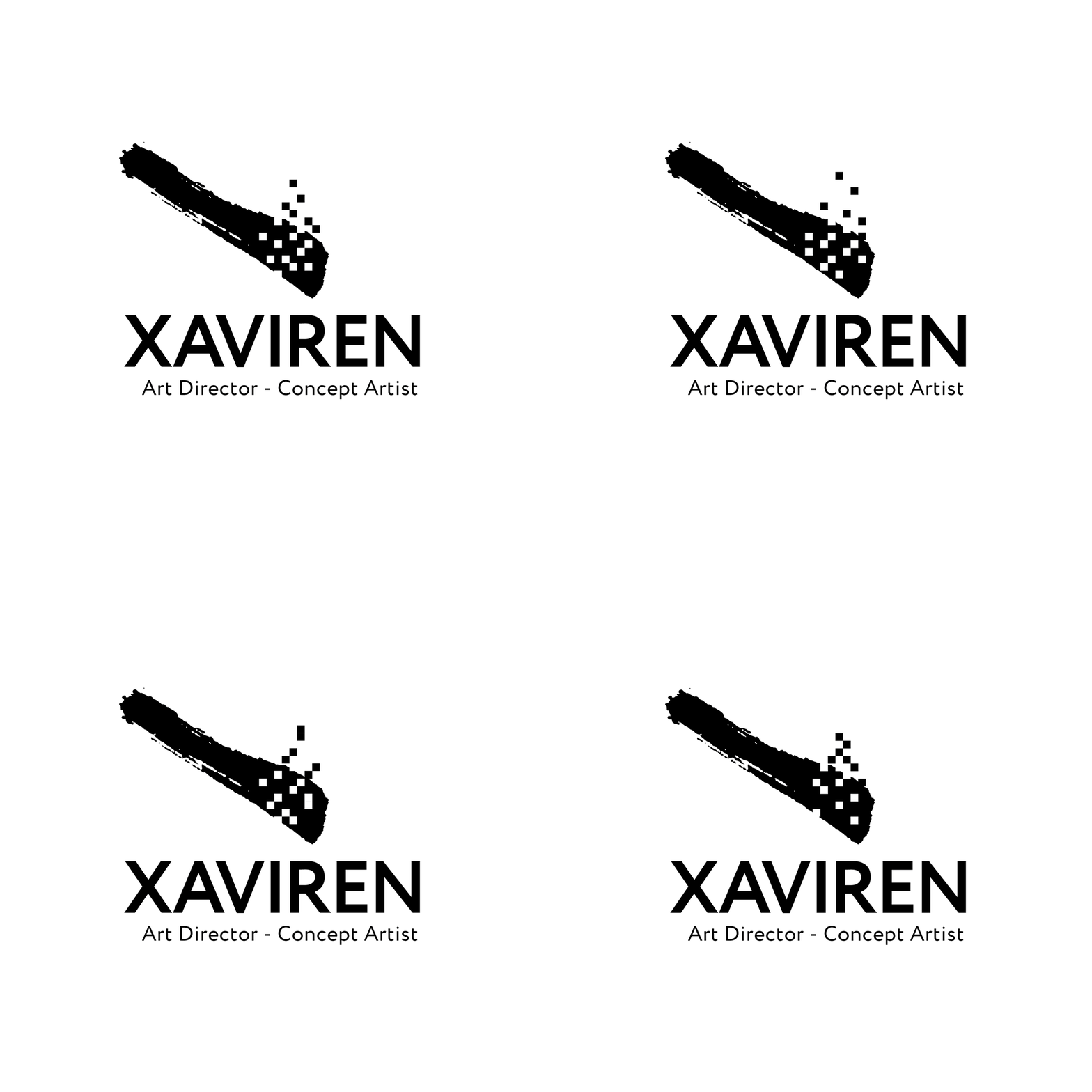
The brush stroke symbolizes a torch and the pixels the fire.
Final logo and freebies
Delivery time! The most exciting part, after the first sketches. Time to cash out and give away your work. The client was pretty happy!
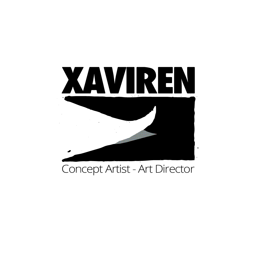
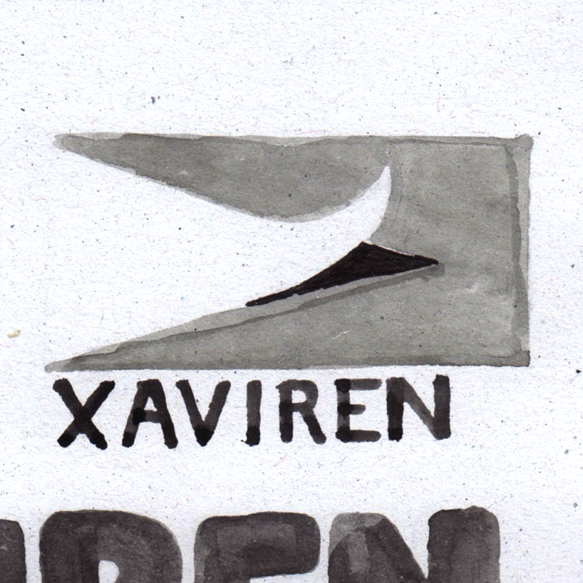
This logo bellow was the chosen one. It mixes the idea of brush, as we have a rough stroke coming from the top corner, and the the idea of pixel, having the stroke framed on a black square.


